History of BW.o Site Proposal
| Version 1 | Current version | |
|---|---|---|
Ok, here are my thoughts about how to implement a cleaner, simpler, more intuitive bw.o front page with wow! Wen people come to a sites front page, they usually have questions like:
I believe that a front page needs to address those questions, in a left to right sequence. Hence ....
Front page (mind map) 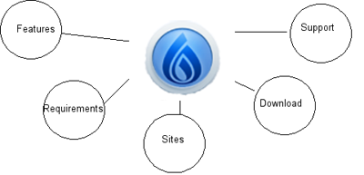 Personally I get the idea of Newtons Cradle when I look at this mind map, and therefore this could perhaps be the front page as a still image. When I see the image of newton's cradle I always 'feel' the movement and 'hear' the sound it makes. Its 'soothing' and consistent. I like what it implies – perpetual motion – ie the project always being worked on. Perhaps the front on idea is the better as this also implies 'future' in its perspective. And taking that further you could 'watermark' the bw logo under the balls like in the image below. If using the side on idea I would probably place the bw logo on the wooden base plate if using the entire image. Front on  Side on  So lets take those ideas further (each tab is another depth of page structure.) 1 Features
2 Requirements
3 Sites
4 Download
5 Support
So thats just a start. What does anyone think? I feel that much of the wiki needs to be deprecated. There are approximately 600 pages on the BW.o site. I also feel that there needs to be some more streamlining between bw.o, sf, and irc for information. Perhaps to showcase the feature of being able to have different layouts and 'skins' that BW is capable of, the wiki, forums, etc could have a different colour of one chosen layout (all in the same tone). Unfortunately I am an ideas and designs person and do not have the skills to 'whip up' a front page like this, but if the community is ok to go down this track I can spend some time in diagramming the downstream pages in more detail, and rearranging things (with full consultation unless you are happy to set me free on my own rampage). Since submitting this proposal as a pdf, I can appreciate that the titles given to the drop-down menu's up the top may be substantiated as 'normal' in the development community. So the question may need to be asked - are all users developers? Or are all developers, users? And hone the titles to the master set perhaps? I have also submitted to one of the dev's some visual ideas for the BW.o site and will include these in this discussion asap. | Ok, here are my thoughts about how to implement a cleaner, simpler, more intuitive bw.o front page with wow! When people come to a sites front page, they usually have questions like:
I believe that a front page needs to address those questions, in a left to right sequence. Hence ....
Front page (mind map) Personally I get the idea of Newtons Cradle when I look at this mind map, and therefore this could perhaps be the front page as a still image. When I see the image of newton's cradle I always 'feel' the movement and 'hear' the sound it makes. Its 'soothing' and consistent. I like what it implies – perpetual motion – ie the project always being worked on. Perhaps the front on idea is the better as this also implies 'future' in its perspective. And taking that further you could 'watermark' the bw logo under the balls like in the image below. If using the side on idea I would probably place the bw logo on the wooden base plate if using the entire image. Front on Side on So lets take those ideas further (each tab is another depth of page structure.) 1 Features
2 Requirements
3 Sites
4 Download
5 Support
So thats just a start. What does anyone think? I feel that much of the wiki needs to be deprecated. There are approximately 600 pages on the BW.o site. I also feel that there needs to be some more streamlining between bw.o, sf, and irc for information. Perhaps to showcase the feature of being able to have different layouts and 'skins' that BW is capable of, the wiki, forums, etc could have a different colour of one chosen layout (all in the same tone). Unfortunately I am an ideas and designs person and do not have the skills to 'whip up' a front page like this, but if the community is ok to go down this track I can spend some time in diagramming the downstream pages in more detail, and rearranging things (with full consultation unless you are happy to set me free on my own rampage). Since submitting this proposal as a pdf, I can appreciate that the titles given to the drop-down menu's up the top may be substantiated as 'normal' in the development community. So the question may need to be asked - are all users developers? Or are all developers, users? And hone the titles to the master set perhaps? I have also submitted to one of the dev's some visual ideas for the BW.o site and these are included for discussion here: I think that the screenshot of Plone is the very best compromise for BW.o at this time. 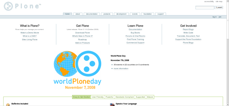 It shares similar colours, the entire front page layout is clear (and therefore does away with my idea of having an 'entry' page),etc etc. The website is plone.org ------------------------0o0------------------------ The others though have various aspects that I like, so I include them for consideration. The b2evolution screenshot shows the menu names but also the 4 ways to answer the question about what the software is and does. Perhaps something like this is all that bw.o needs for now somewhere at the 'front' of the site, while the 'back' of the site is mainly for admins and devs? I would of course still like to see ABG expanded to match the technical documentation. 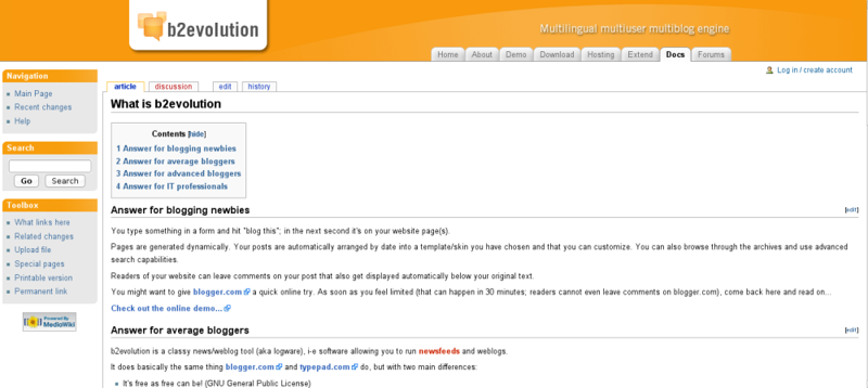 (We use this blogging software and really like it.) ------------------------0o0------------------------ Next is one of the original BW screenshots - showing that once upon a time it did use complete words instead of shortened ones! So this backs up my preference!  ------------------------0o0------------------------ The Drupal Menu is self explanatory. But perhaps the tip to take out of this one is that colour is used to break up the boundaries between header and the rest of the page which is white.  ------------------------0o0------------------------ The picture of from Exponent is for bug reporting. This is another thing we could re-introduce to prominence to BW (originally BW had a spray can and a bug to represent bug reporting). It represents another way that users can contribute to improving the software if they are not programmers.  ------------------------0o0------------------------ Next on the list is Frog. This too seems a compromise between an outside front page and the rest of a site - the large header never changes but each of the menu's under it changes what is shown in the side bar - an alternative to suckerfish dropdown menu's. I have included this more from the point of view that its a concept that I like but not something that I really think folks will go for. 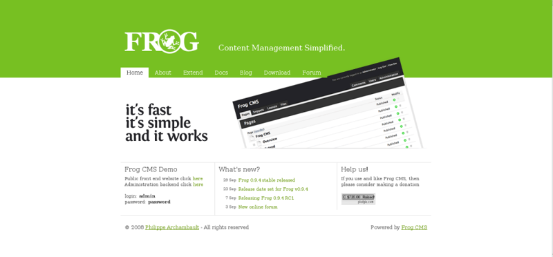 ------------------------0o0------------------------ Movable Type is again an example of using colour blocks to define areas. Personally I like the dark colours for a website - to me that says professional', 'outstanding'. This is not to say that all the website has to be that way. I don't think their menu names are that great, but I do like that in the header is the name, and slogan.  I tend to like the sign in areas 'hidden' up in the top right too. ------------------------0o0------------------------ liferay.png is another example of darker colours, beautiful coloured front page image that makes you go 'wow' or at least 'cool'. It shows that you can have the same fixed header throughout the site and yet still have a front page. 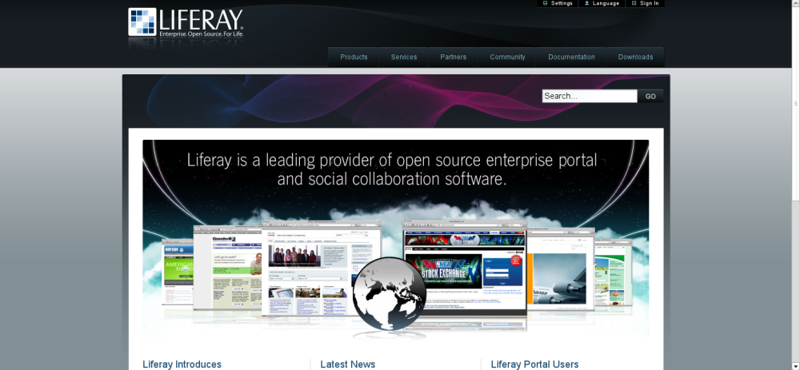 ------------------------0o0------------------------ And last but now least is the Opencms screenshot. This one I could see BW.o easily adapt as colouring the modules is only a matter of css. Again I don't think this will be a 'winner' with everyone, but I think it has its merits. Perhaps instead of bright colours, the bw.o modules could be all the same graduated shaded boxes? 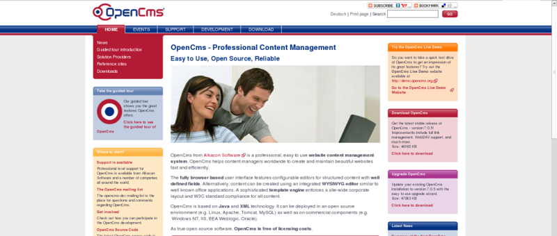 The other thing I like about that site is the definition of the body area by using another 'background' colour at the sides - where if a person has a smaller screen size I would presume disappears to show only the mid section - therefore losing nothing of the site layout. |